What makes a good vacancy website?

In today's tense job market, simply posting a vacancy on Facebook is seldom enough. Attracting new staff depends on a successful employer branding strategy. Perhaps the most visible part of this? Your vacancy website.
Is your corporate recruitment site attractive (and clear) enough to convince a candidate to apply for a job with you? Does it sufficiently display your organization's identity? Or is it just a listing place for your vacancies? A good vacancy website contributes to strengthening your employer brand. Therefore I have tried to figure out what exactly makes a good employment website.
Texts that actually have something to say
Although today's candidate is more visually oriented than before, you (of course) cannot escape having texts on your website. How else are you supposed to get your message across? But, texts can be more than a boring enumeration of soft and hard skills you are looking for in an employee. Good texts contribute positively to radiating your corporate culture and propagating the core values you stand for.

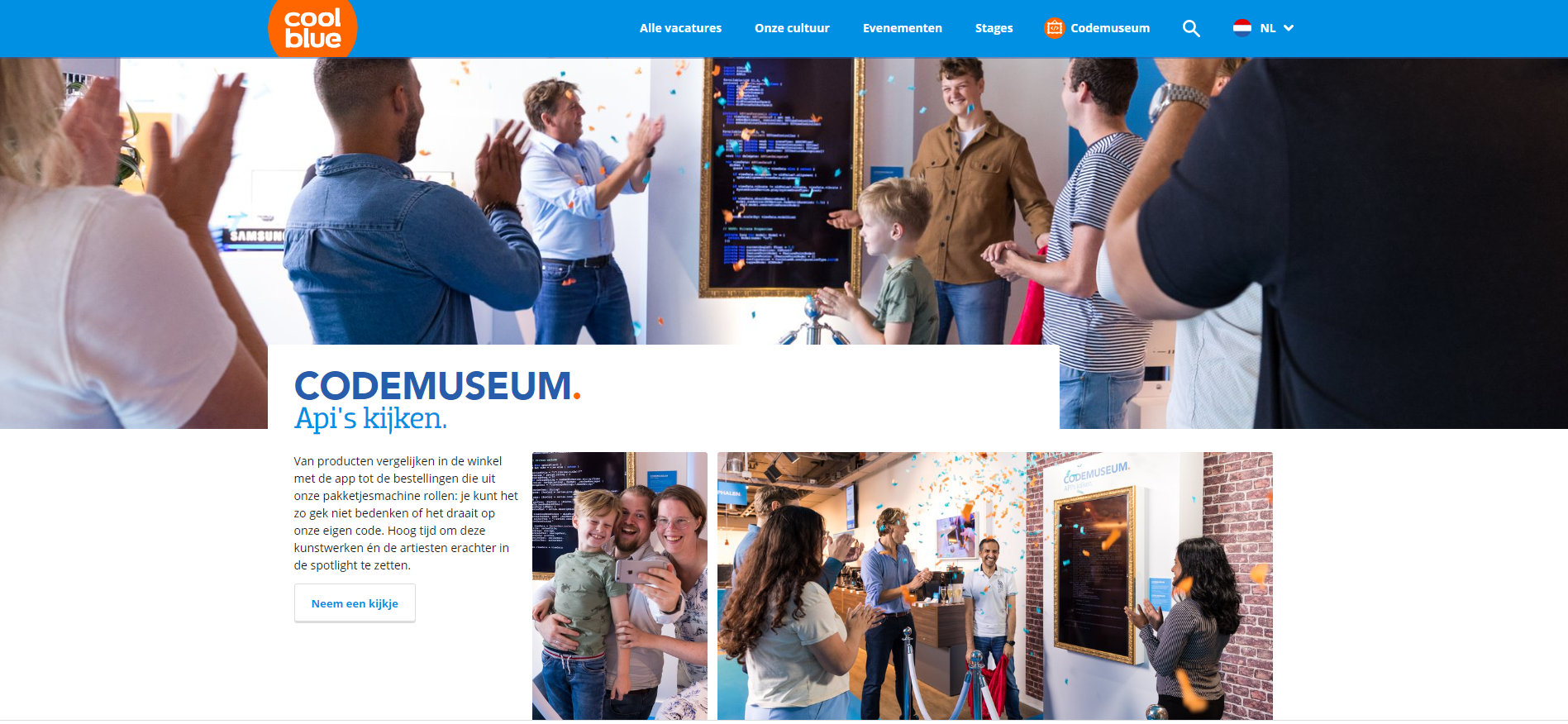
Possible the leader in this field? Coolblue. With their mission "anything for a smile" they have been conquering the e-commerce market since 1999, but also secretly my heart when it comes to labor market communication. Like their mission, the texts on the website do everything to put a smile on the faces of the reader. They achieve this very effectively with phrases like “Code museum. Bits and pieces.” or "Get your black belt in pleasing candidates."
Keep in mind that humor on a vacancy website can be either a smash hit or a complete miss. Awareness of the kind of organization that you are and the kind of employee that goes with it is key. So humor is not a requirement for a strong (corporate) story. The Dutch De Belastingdienst (Tax and Customs administration of the Netherlands) demonstrates this nicely on their vacancy website. Less informal than Coolblue, but full of to the point text that immediately makes it clear to you what kind of organization you are dealing with, without it ever feeling boring or stuffy.
An organization with personality
If you've ever googled "tips for a good vacancy website", you're bound to have come across the following advice: make it personal. But how do you make a vacancy website personal? One way is to give your employees a platform to keep your story as personal and authentic as possible. Show what the colleagues within your organization really look like. Coolblue for instance shows employees through photos and their shared company outings.

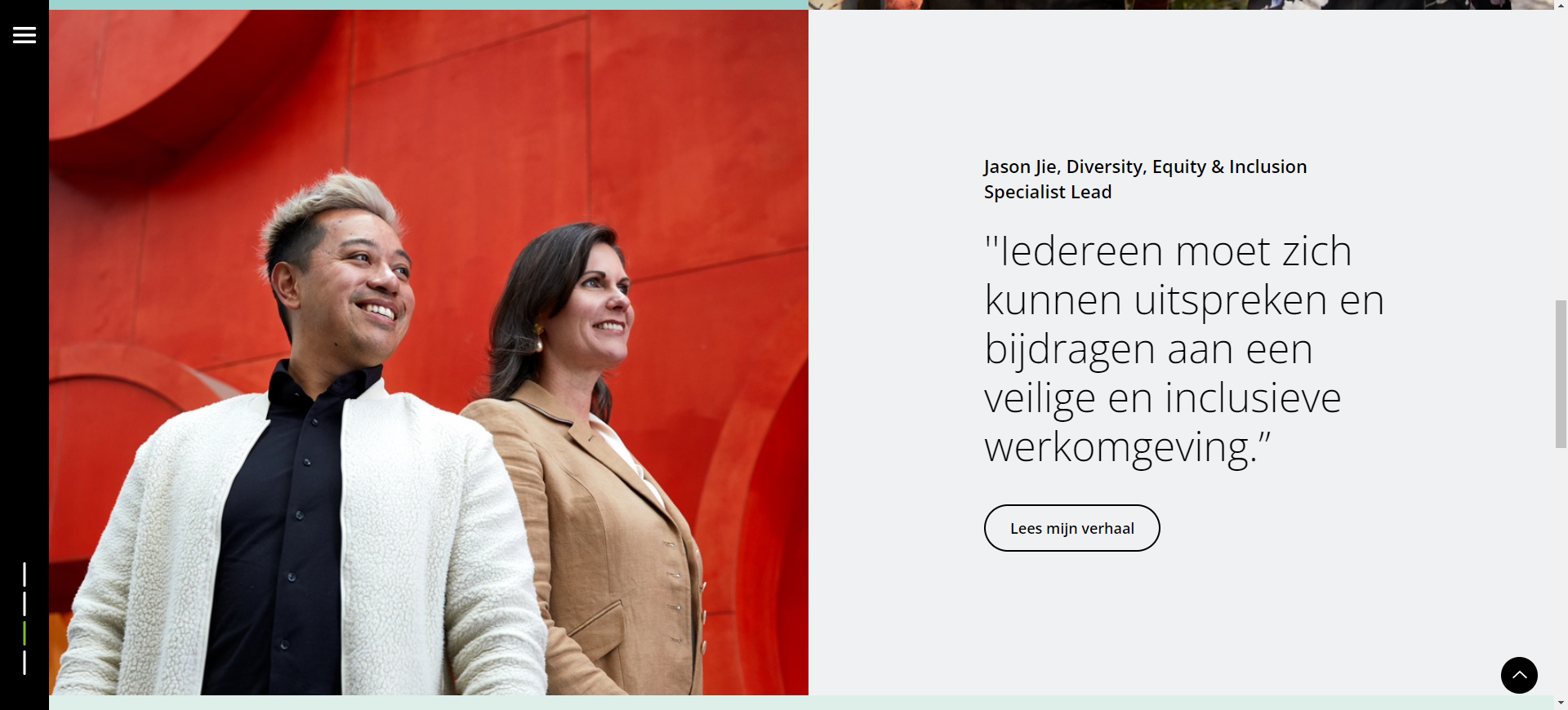
One company whose entire recruitment site strategy is built around the people behind the organization, and which in my opinion does a fantastic job, is Deloitte. On the homepage, they put their people at the center and you are immediately triggered to read the personal stories of the employees. The portraits of these employees really take center stage. In an article by Werf-en, Sjoerd Kuipers of Stuurlui writes "be diverse" as one of the 10 commandments for corporate recruitment websites, but disingenuous diversity is something a candidate can spot from a mile away. It’s better to actually show who really works for you.
Deloitte is not the only successful worksite focused on showcasing your potentially future colleagues. A.S.R. also approaches their vacancy website from this strategy. On their website you can scroll through employee testimonials and stories as if you were looking for a job post, that's how many there are. This really gives you as a job seeker a good idea of the kind of workplace you will end up in. The people at A.S.R. are really their focal point, and this becomes quite clear when you see all their communication.
But, it can also be a little more low-key. At a company like vanHaren you won't see a photo on their vacancy site without an employee on it, and they (clearly) also put their employees in the foreground. They really want to show and convey what kind of people work at vanHaren. Not only in the stores, but also at headquarters and within logistics.
Pictures say more than a thousand words
With good friends you usually need but half a word. With good vacancy websites, the same is also true. And, some companies lend themselves perfectly for a visual rather than a primarily textual story. The Department of Defense undertands that all too well. The hero banner, this is the first image and typically the eye-catcher of a recruitment website, shows us a visual story that immediately triggers a feeling. It conjures up an emotion, it makes you want to be part of that story.
Organizations like the Department of Defense are great for building a and sometimes also building upon an existing image. The Dutch Police force, for example, also achieves this quite successfully with a video reel in their hero banner. But De Belastingdienst, with a significantly stuffier image as an organization, also perfectly knows how to use video to set an atmosphere and convey a feeling. Take a moment to click through their expertise pages and you can’t deny also being a little bit impressed by the story, right?

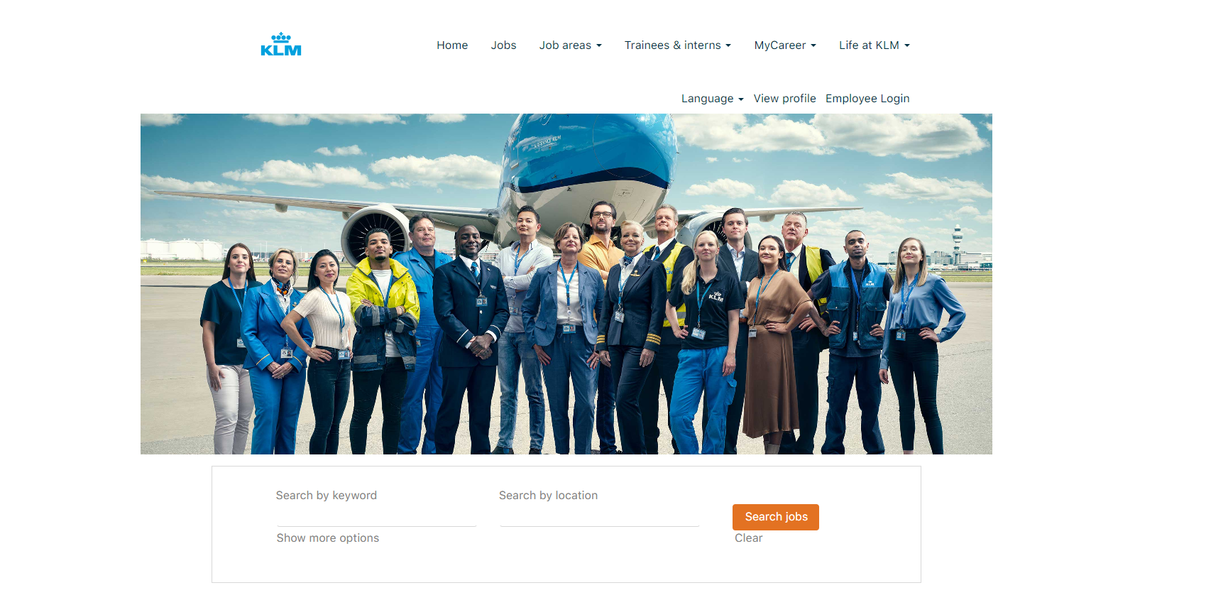
On the other hand, developing video's (or having them developed) is not a cheap job. But even with stills you can effectively portray a company's image, as KLM proves on their website. Picnic in turn does this by deploying region-specific recruitment pages, such as one at Utrecht. Perhaps as a Utrechtian myself I am somewhat biased, but I think the personal touch works well.
Design does not undercut usability
You may dress up the website and the employer very nicely, however if a website does not adhere to the minimum conditions of a good vacancy website, the site will never work for them. So, you will have to think about the image, about your employer branding strategy, about your personality as an organization, but you will also have to ask yourself the following questions: as a candidate, am I able to apply easily? Do I have the possibility to set up a job alert? Are there filters for the open jobs to make searching easier? Is there a clear menu navigation?
In other words, did you adhere to the best practices for a vacancy website. Lastly, as well-scoring website, we will take NS as an example for the following "best practices" checklist.
- Logo can be found at the top left and is visible on each individual page.
- There is a clear navigation of the website.
- The corporate identity of the vacancy website is in line with the corporate identity of the organization. Preferably with recurring recognizable style elements.
- There is a search bar on the homepage that makes it easy to search for jobs. A positive aspect of NS is that this is designed like the route planner on their regular website.
- Good use is made of (moving) images.
- A Job Alert is present. Extra pluspoints for showcasing the job alert on the homepage and throughout several points in the customer journey.
- The extensive employee content.
- There is a (visual) representation of what the application process will look like.
A vacancy site that works
But in the end, what do all these examples have in common? What makes a good vacancy website? The fact that they all tell a clear and unambiguous story. The personality of the organization shines through in both text and image.
In addition, it then helps if it also has a unique identity. You'll get even more points if the website is also user-friendly and easy to navigate.
Have you already evaluated your website, maybe compared it to the checklist above and aren’t you scoring to good? Are you and your organization running into employer branding issue, or don’t you have any idea where to start? Please don't hesitate to contact us. We have spent years specializing in recruitment websites that work. We also have several professional and knowledgeable partners, with whom we connect, who would love to be your sparring partner.
Just to name a few OTYS partners: Stuurlui, Rankdata, GetNoticed or Booston. Ready for a new step? Take a look at all our web solutions.
